Role
Product Designer | UI Case Study
Expertise
Figma, Mobile Design, Resposive Design, Design System, Prototyping, Mockups, Animation
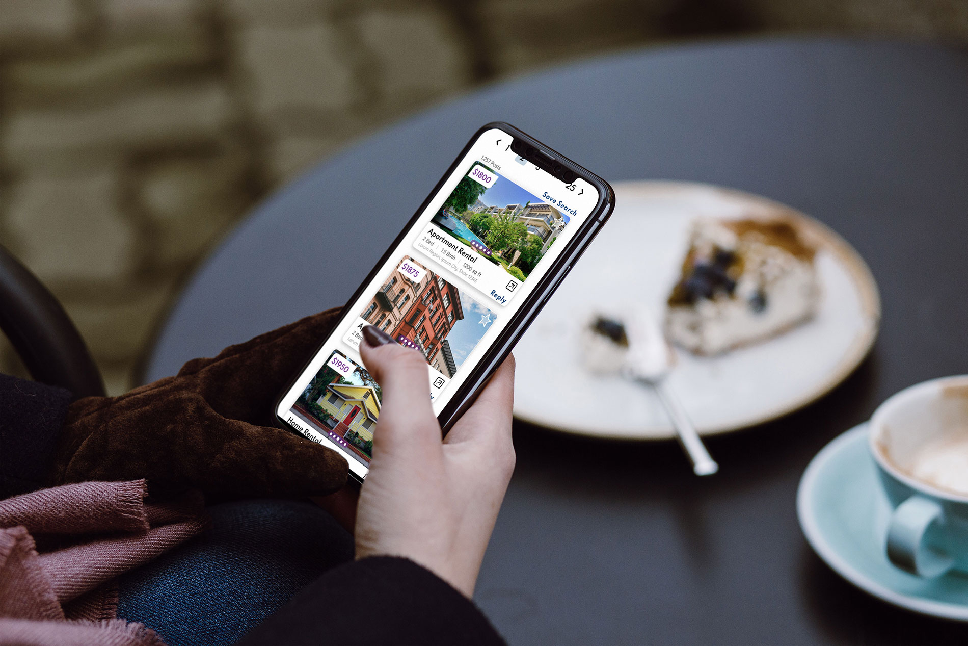
Craigslist's current website application has minimal branding, scant visual design, and the layout is overlycomplex. People need a way to search modern day classified ads in an intuitive way, with increased brandrecognition and confidence in the platform.
I created three user personas who had different needs in using Craigslist:
Now that I had a good understanding of where the problem areas are on the current website, I set out to find solutions. I decided to simplify the visual clutter, and streamline the user flows. I wanted to create something modern, clean, and intuitive.
In redesigning an existing brand, I first gathered the typography and color choices already being used. I decided to keep the existing logo of the purple peace sign and the word "craigslist" written in lower case letters in Times New Roman font. I also wanted to shift from the current utilitarian bare-bones feel of the app to something more inviting. With these few simple elements in mind, I created two distinct mood boards.

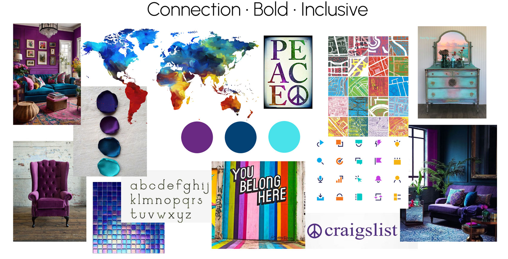
After weighing my options, I decided to go with the “Connection, Bold, Inclusive” mood board, which has bold colors and photography. Craigslist is an international organization which currently has a bold color palate, so I felt this mood board encapsulated the current brand better than the other.
After analyzing a few of Craigslist's current user flows, I brainstormed some ideas for improvement and drewsome low fidelity wireframes. I then created some mid fidelity wireframes to work with as I refined mydesigns. I focused on mobile wireframes due to my mobile first design process.
Craigslist Original Search Screens

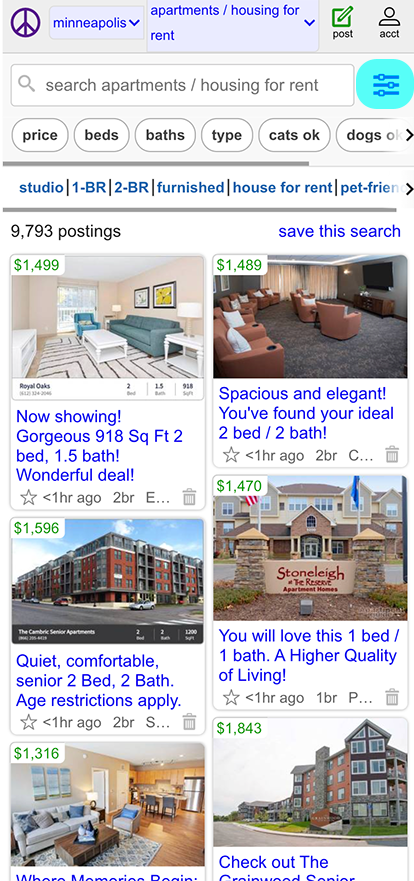
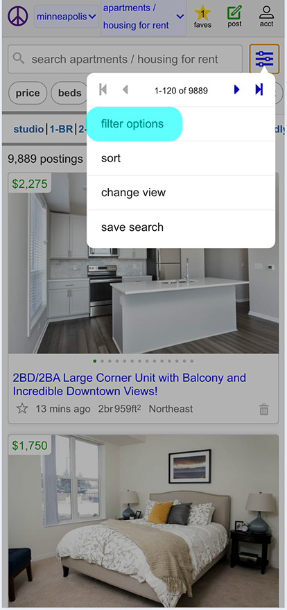
Low Fidelity Search Screens
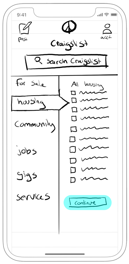


Click here to view the entire set of low fidelity wireframes onFigma.
Mid Fidelity Search Screens
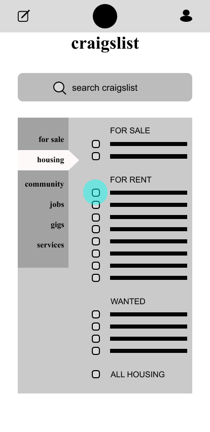

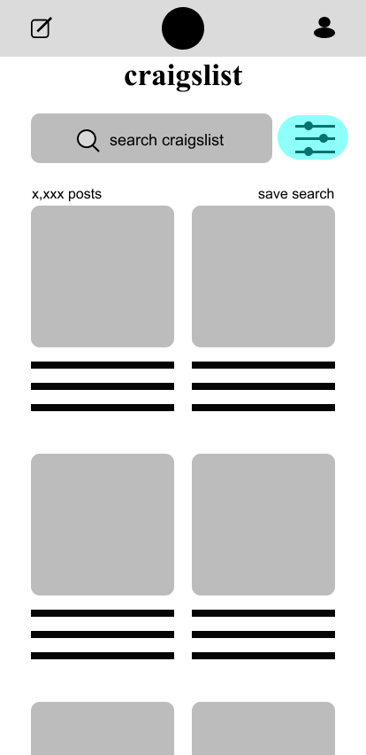
Click here to view the entire set of mid fidelity wireframes on Figma.
I added to Craiglist's current style guide a great deal, since they are using very basic fonts and colors. I added more colors to the color palatte, in addition to the purple Craigslist uses in their peace sign logo, I added navy blue and a teal to compliment the purple. I decided on two new fonts: Spartan for titles, and the very readable Quicksand for body text. I created a new icon set, giving a nod to the classic icons Craigslist currently uses with a modern twist. I then created a design system with reusable components that I would be able to easily use in my app design. This ensured consistency throughout the application on both desktop and mobile views, as well as grids and common breakpoints in order to build a responsive website application.
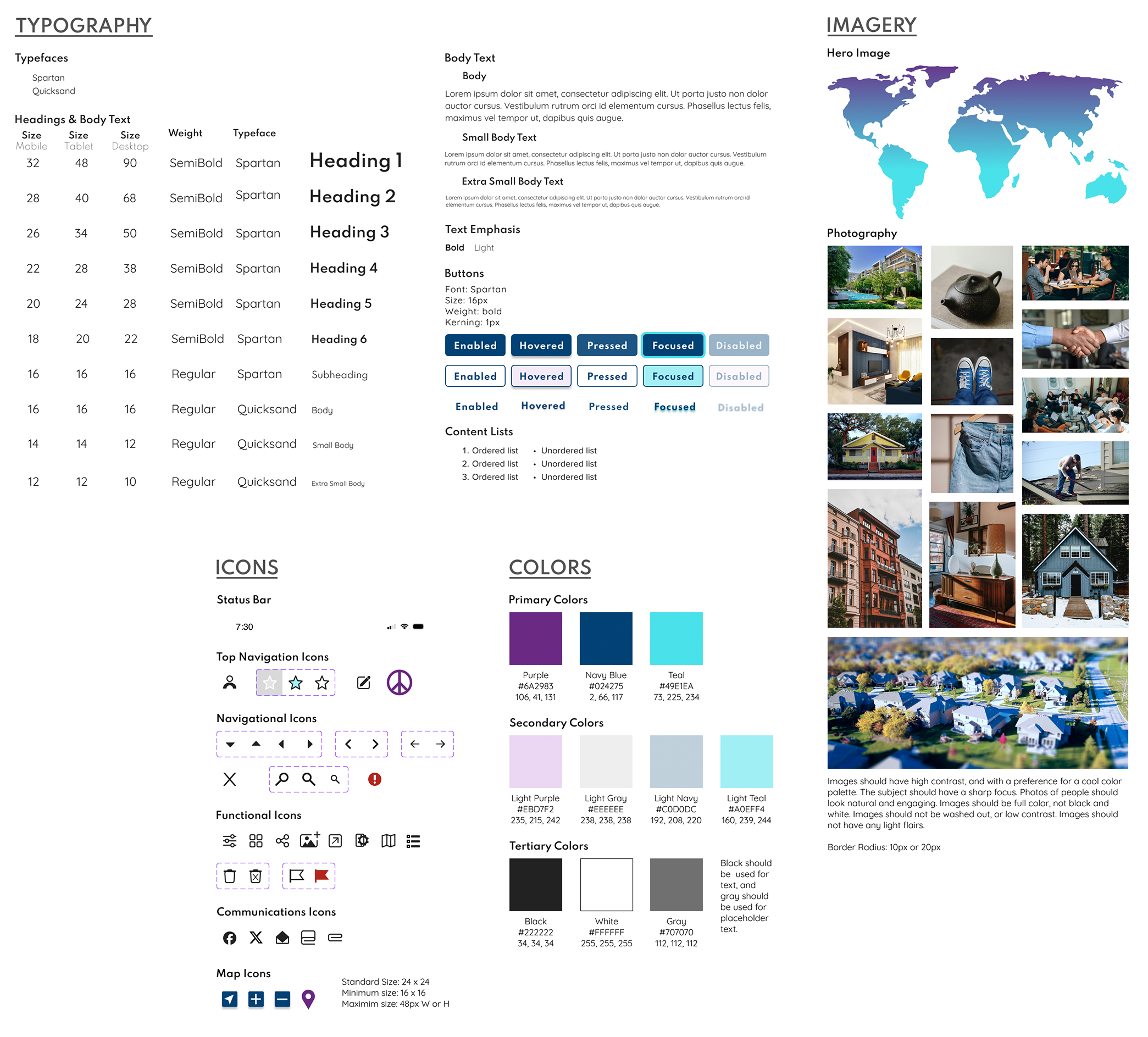
Click here to view the entire design system on Figma.
I noted specific gestures on a few screens of my app, and I also created an animation to illustrate how all the modal windows on the app will function.
Gestures
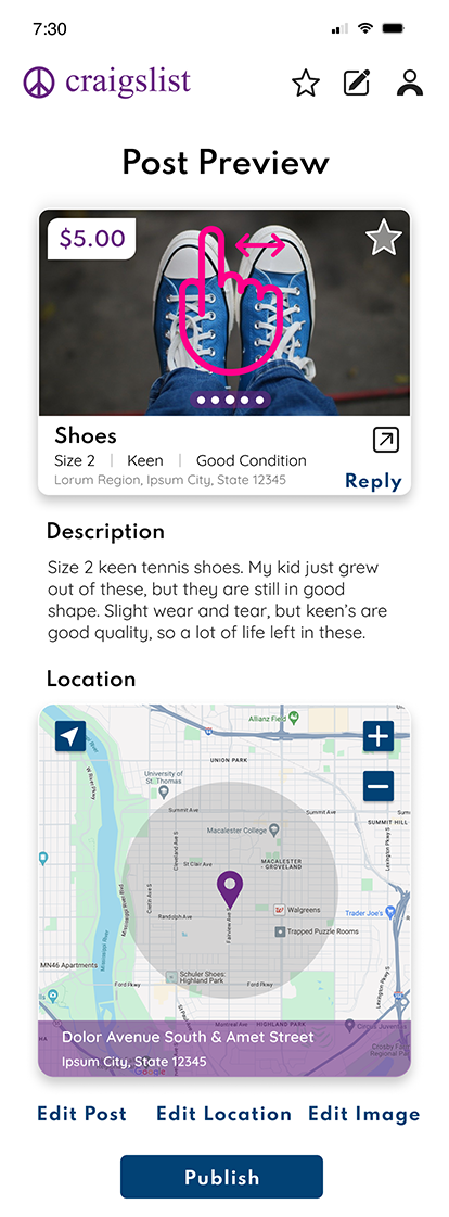

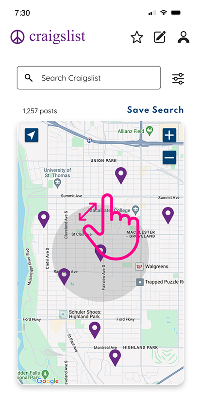
Now it was time to refine my designs and create high fidelity mockups for each of the three user flows. I also was able to create a responsive design for a few screens, so in addition to mobile layouts, I also made a tablet and desktop layout.
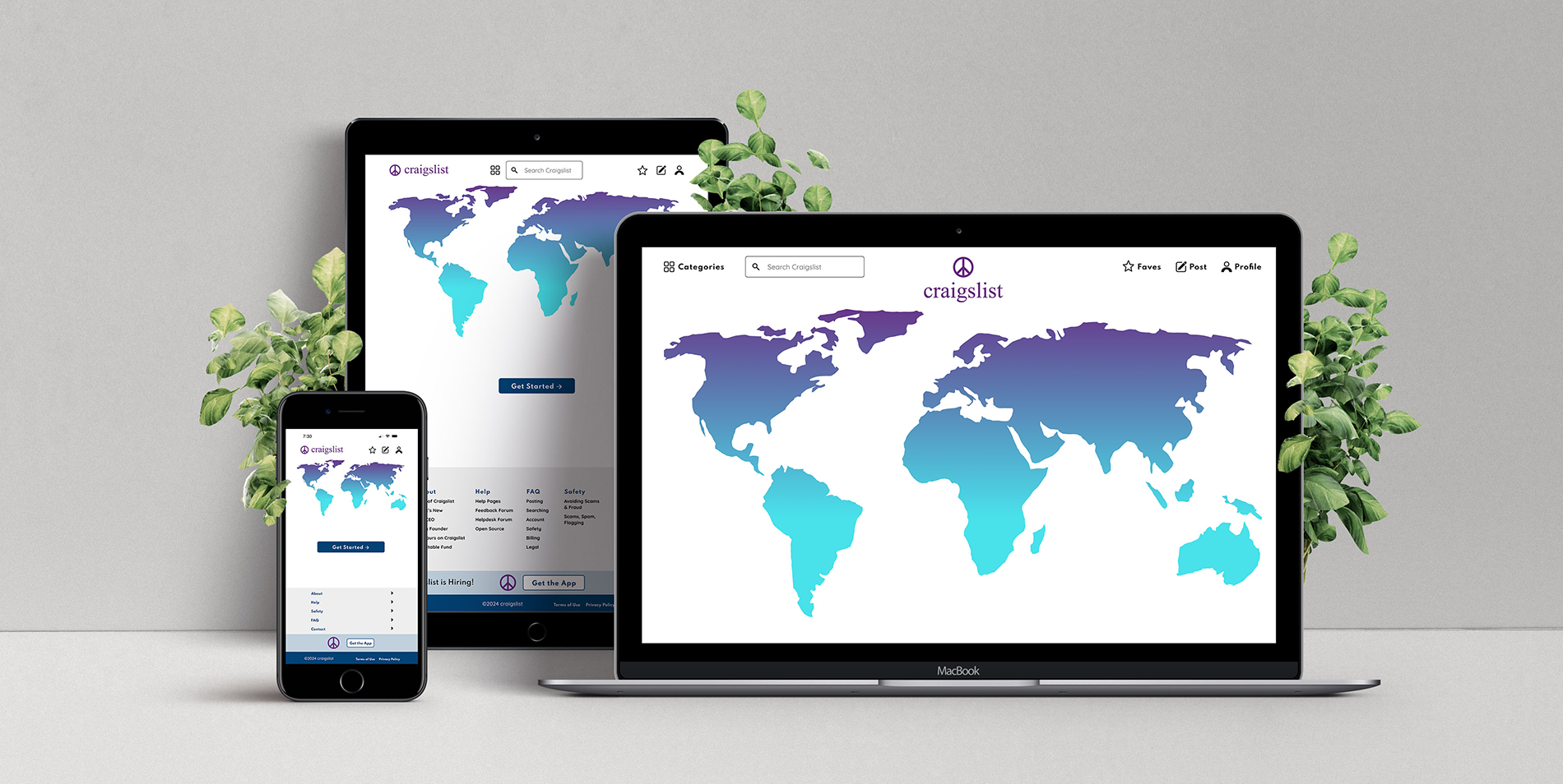
Responsive & Mobile Design Mockups
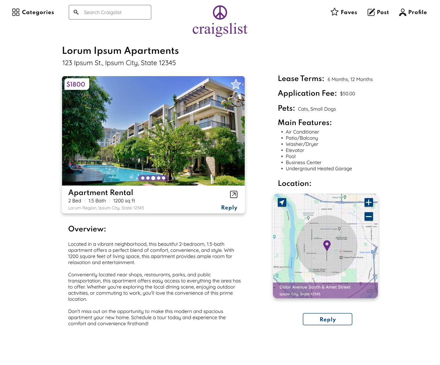


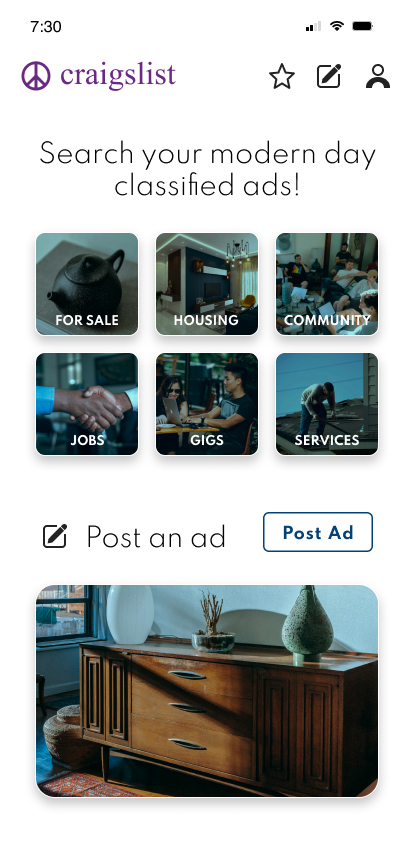
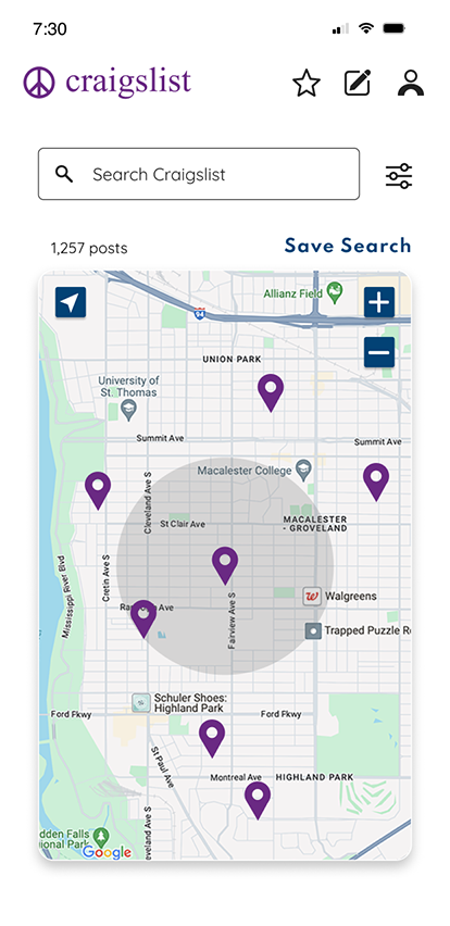
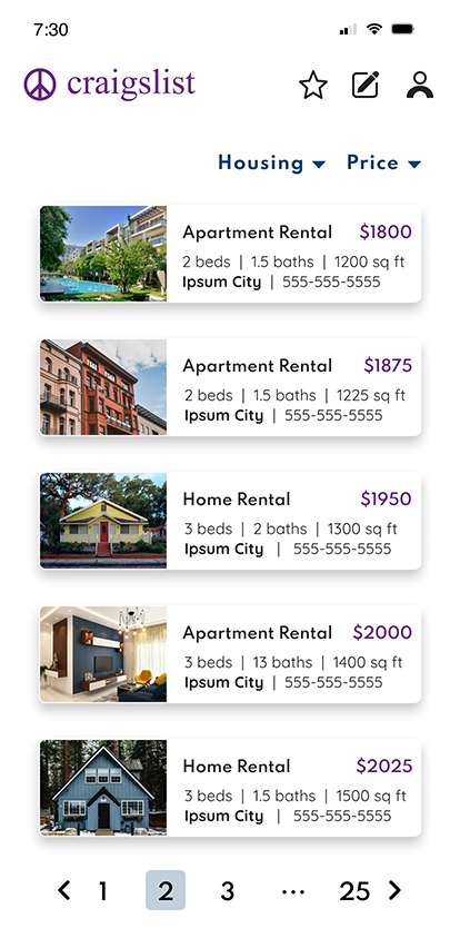
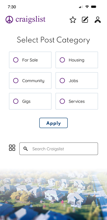
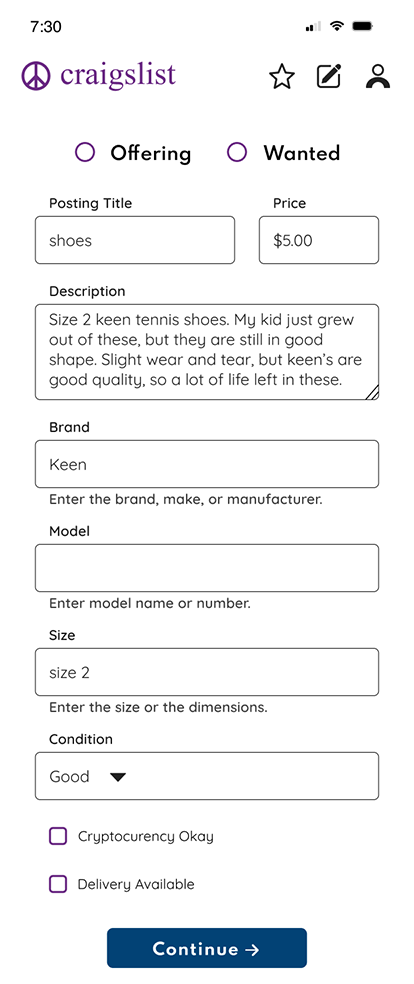
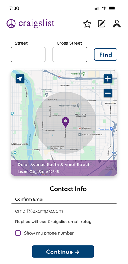

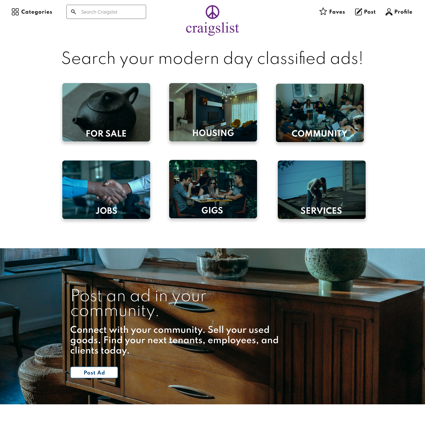


Click here to view the entire set of high fidelity mobile and responsive mockups on Figma.
Before

After
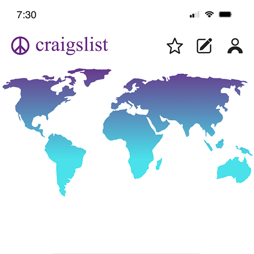
Craigslist's original home page and my redesigned home page.
Before
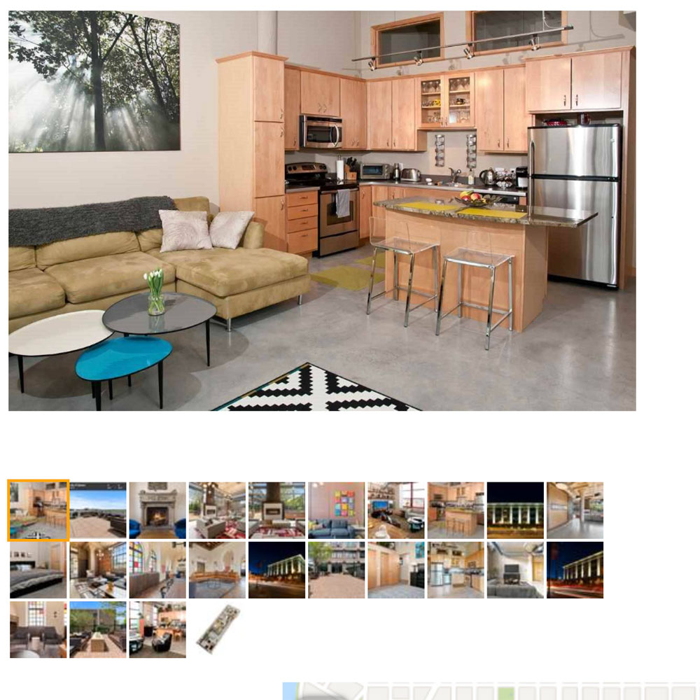
After
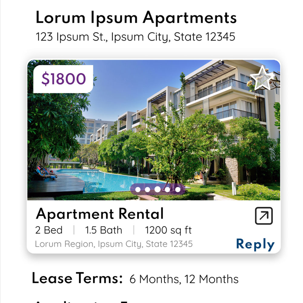
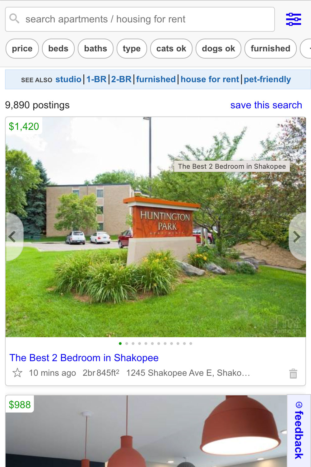
Craigslist's design of an apartment listing where the user is able to view multiple photos by clicking on the smaller images under the large one, compared to my redesigned version of a card where multiple photos can be viewed by navigating through them with a swipe gesture.
Before
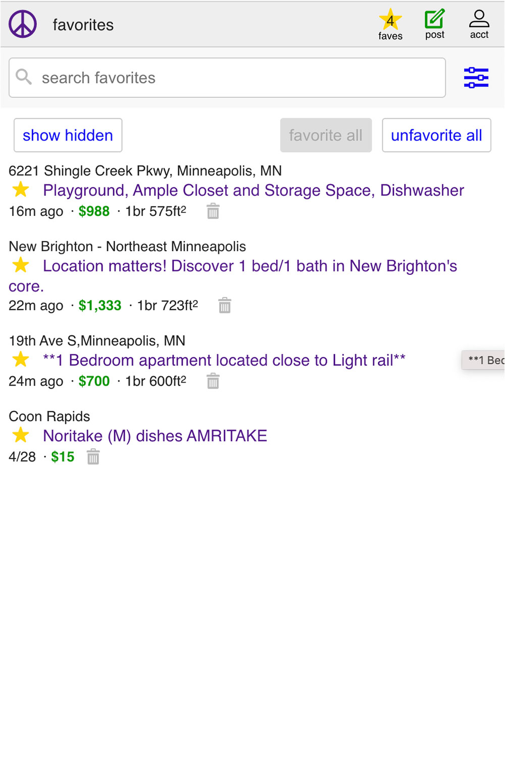
After
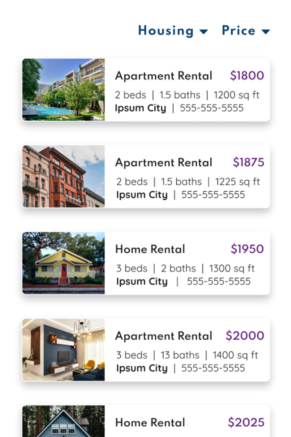
Before
After

I have completed the redesign of the initial three user flows, however this project is ongoing and I plan to continue working on it.
I realized in doing this project that I really enjoy UI and all that is involved in it. I also learned that without the data that user research provides, I was just guessing at what might be more intuitive to the users. Due to that lesson learned, I look forward to conducting some user research and user testing, and then implementing that in redesigning more user flows. The biggest challenge I faced in doing this project was being unsure what the user may find to be an easier more intuitive path than what already existed, which user research and user testing will certainly shed some light on.
I am confident though that my user persona I mentioned above, the busy mom who needed to quickly list her old kid's items for sale online in order to declutter, would be able to do so with my newly redesigned app.