Role
Product Designer
Expertise
Figma, Mobile Design, Resposive Design, Design System, Prototyping, User Interviews, User Research
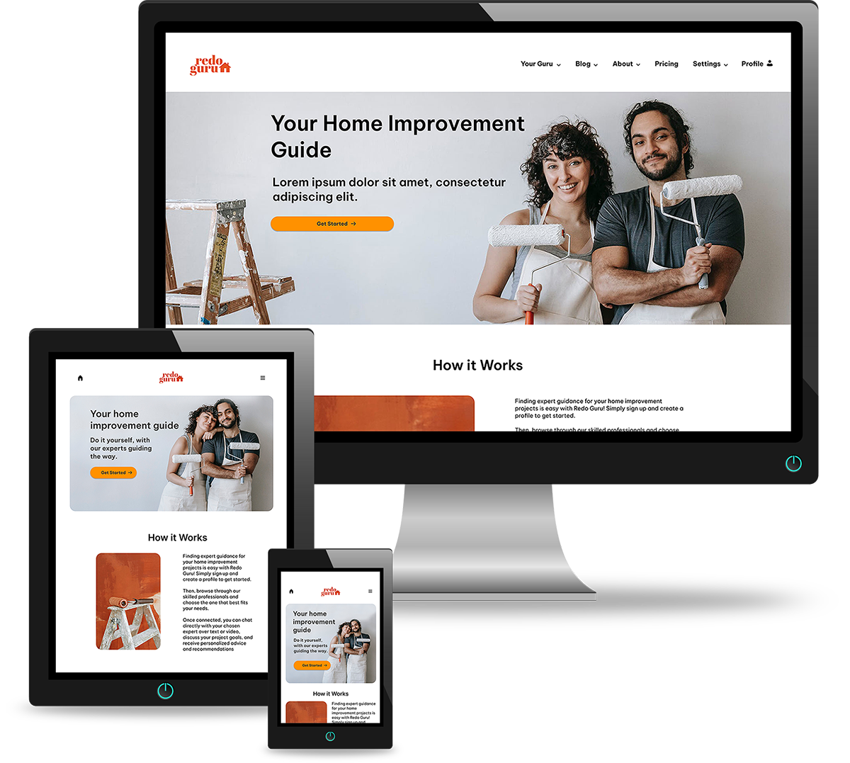
I hypothesized that homeowners need a way to chat with home improvement experts in order to recieve guidance so that they can complete their home improvement projects on their own.
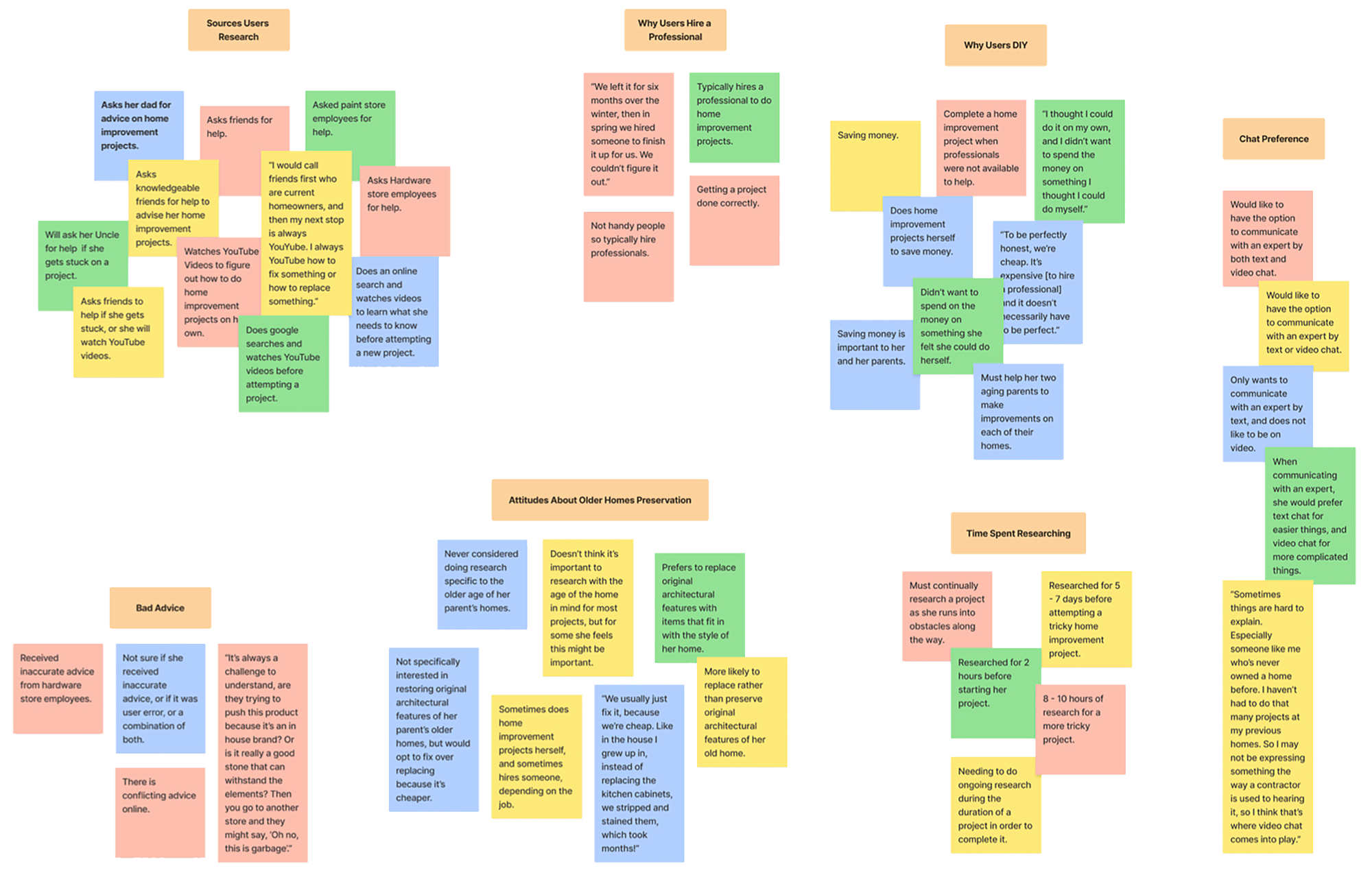
To test my hypothesis I conducted user research creating an online survey which gathered responses from 21 people. I also conducted user interviews with 4 individuals. The survey yielded some interesting results.
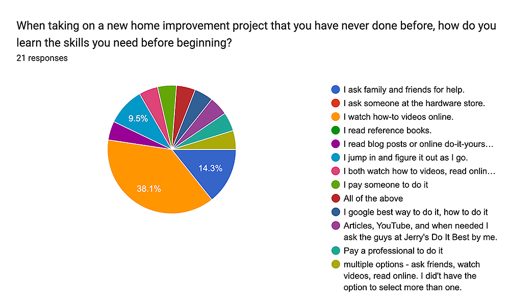
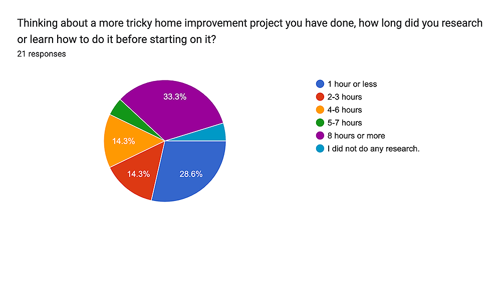
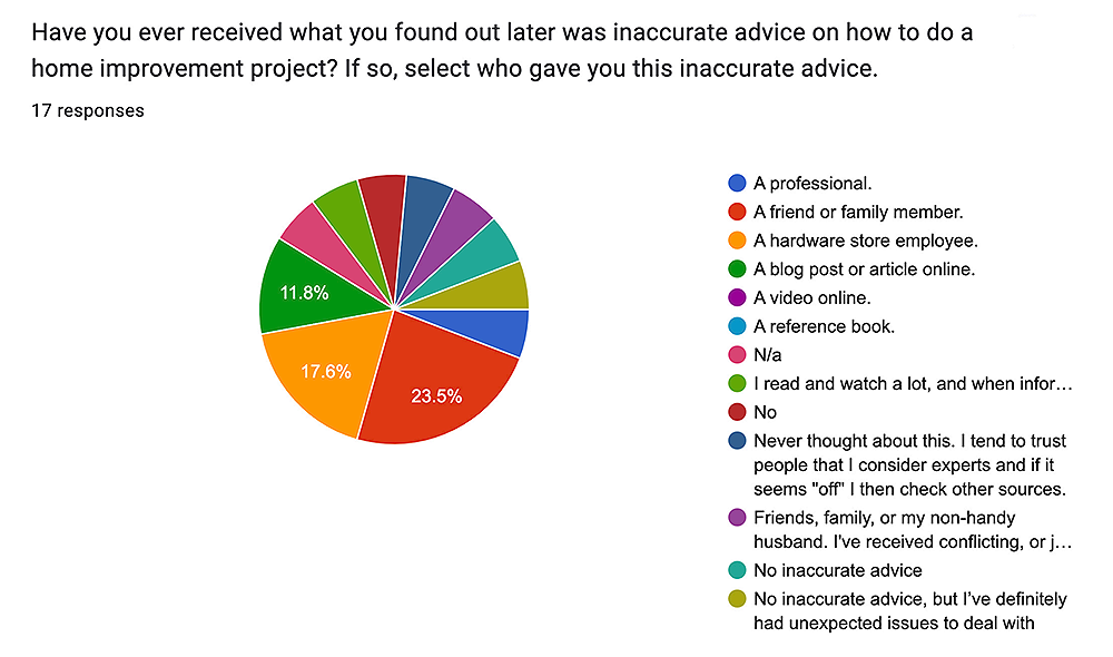
My main goals during my user interviews was to find out how much time homeowners are spending researching their projects, and who they are currently turning to for help. After interviewing 4 individuals about their experiences, I collected the following data:
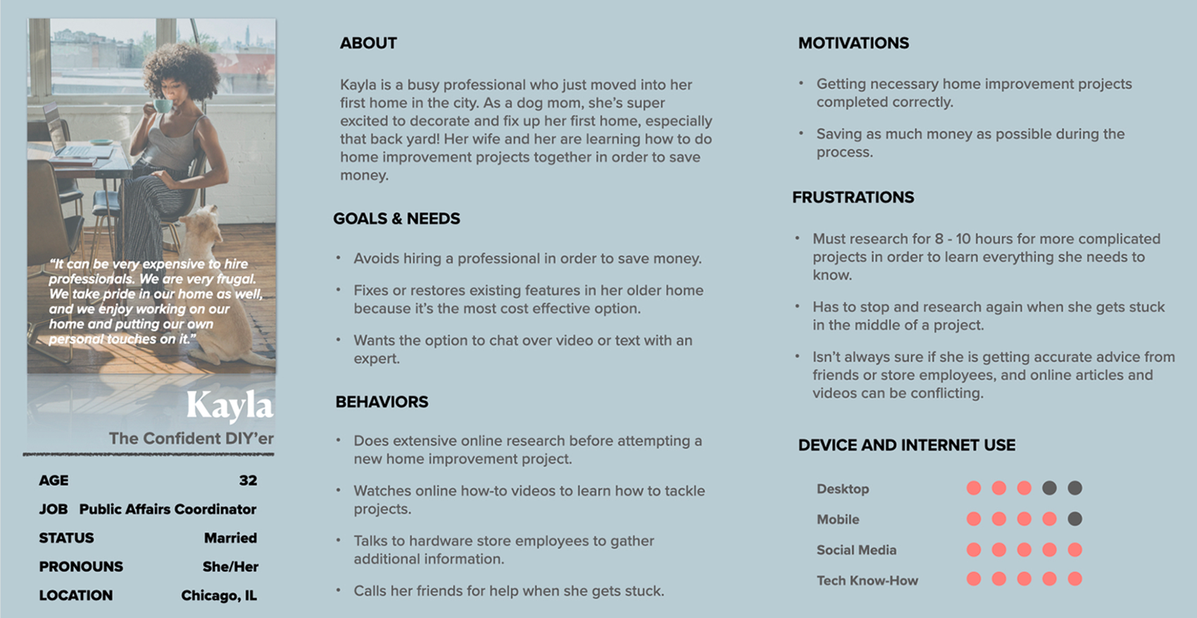
In order to understand my users better, I created two distinct user personas from the four interviews I did. These personas had different motivations and frustrations. One was more excited to attempt DIY projects on her own. The other was more likely to hire a professional. I was up to the challenge of creating an app that would serve the needs of both types of homeowners.

Now that I had a full understanding of what homeowners needed from this app, I created a sitemap. I did a card sort on the sitemap and made adjustments based on those results. I then created some low fidelity user flows, first drawing them out on paper, and later creating low fideltly wireframes in Figma.
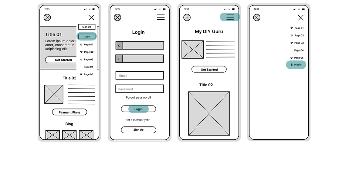
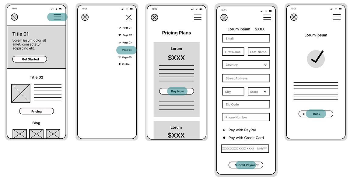
I designed three different wireframe user flows. Users can log into the app where they will be able to access their favorited experts, and other saved data specific to their account. Users can browse experts in their area and search by what specialty they need help with. They are then able to scan through search results, and favorite the expert they wish to work with. There are also three different payment plans which can be chosen based on the user's specific needs.
Login
Browse Experts

Collect Payment
Through moderated in-person usability testing, I was able to assess learnability and errors for new users as I tested to see if they could navigate through the app and complete basic functions. I tested six subjects of different genders, ranging in age from 18-24 to 40-49.

The results of my testing yielded several observations and user errors. Taking all this data into account, I revised my wireframes to enable a more intuitive user experience. I soon had a new set of high fidelity wireframes with much improved user flows.
I then created a style guide for the app in order to determine a color palette, typography, and the style of images to be used. Once I had these design features down, I created a design system with reusable components that I would be able to easily use in my app design. This ensured consistency throughout the application on both desktop and mobile views, as well as grids and common breakpoints in order to build a responsive website application.
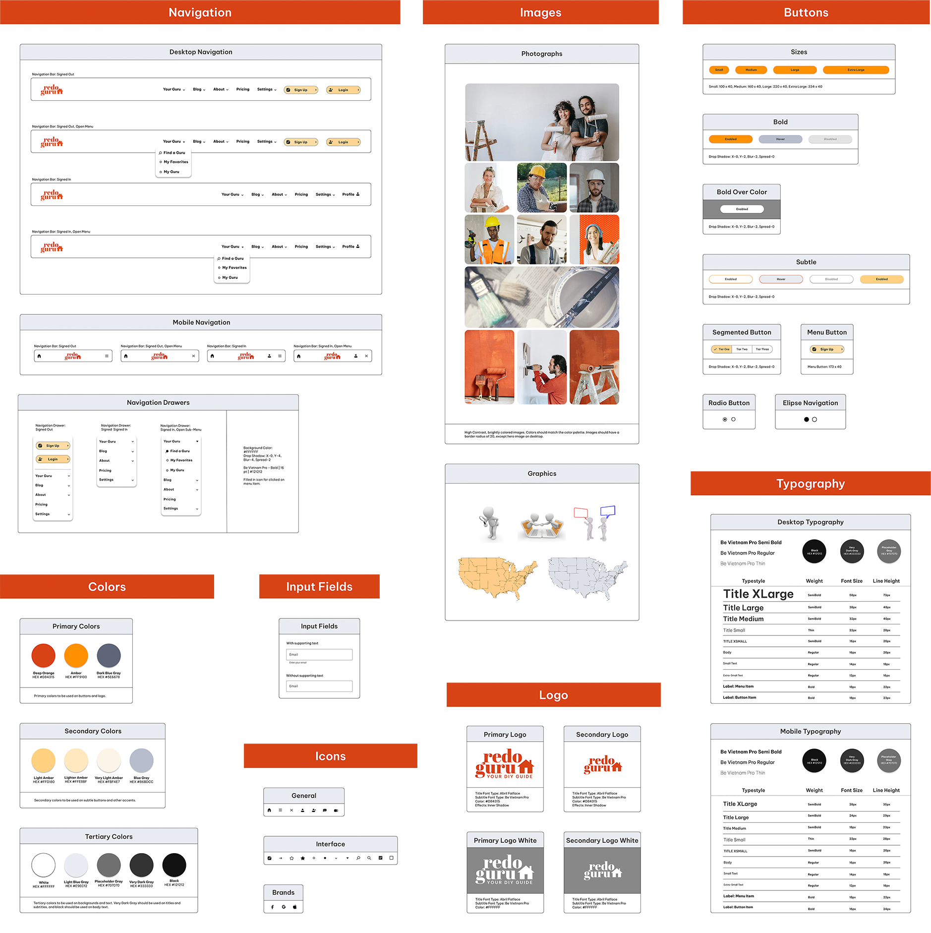
After completing the high fidelity wireframes, I then iterated over the designs implementing Gestalt principles. I participated in a design collaboration and was able to apply many of the suggestions made through this process. Finally I was able to design mockups for each selected user flow as well as clickable prototypes.
Login

Browse Experts

Collect Payment

Click on each user flow to interact with the prototypes:
Gathering user data and conducting user testing provided me ample insights into this project. I was able to use that data
to plan user flows that really benefit homeowners using the app.
I think there is room for improvement on the UI of the app. I plan to implement more consistent spacing using an 8pt grid, and
redesign the home page on the mobile view. I would also like to design a set of unique icons specific to this app. In the future,
I will create mood boards and select one to go with in order to have a more clear visual design direction sooner in the project.
My user persona, Kayla, can now easily join Redo Guru at the Plus Plan level and recieve 3 video or text chat sessions
for $30.00 per month. As she plans to build her 300 square foot deck, Kayla weighs the costs of hiring a professional
versus having Redo Guru guide her through her project. Kayla finds that hiring a professional would cost her $9,000.00,
but doing it herself would only cost $3,030.00 - the cost of materials, plus a months subscription to Redo Guru. Kayla will
save $5,970.00 on her project! She will also have the satisfaction of having completed it herself, without spending hours of
her time researching how to do it because she has a Redo Guru she can chat with to give her expert advice.